Mobile Mode
MapsAlive has a unique mobile mode feature that is automatically enabled for tours that are run standalone on small mobile devices like phones. On desktop browsers and large mobile devices, tours run in desktop mode.
Mobile mode makes a tour look and behave much like a mobile app even though the tour is running in a browser. It provides the benefits of a mobile app user interface, but people don't have to download and install a mobile app to use your tour.
How to manually enable or disable mobile mode
Mobile mode is automatically enabled on small mobile devices, but you can override this behavior. You can make a tour:
- Run in desktop mode on small mobile devices (see an example at the end of this page)
- Run in mobile mode on desktop browsers and large mobile devices.
Mobile mode and desktop mode are mutually exclusive, that is, by disabling mobile mode you enable desktop mode. By enabling mobile mode, you disable desktop mode.
There are two ways to manually enable or disable mobile mode:
- Use the
mobiletour setting or - Choose Tour from the Tour Builder menu
- In the Mobile Mode section of the Tour Manager screen:
- Select True or False for the Mobile Mode option
- In the Mobile Mode section of the Tour Manager screen:
Mobile Mode Advantages
Mobile mode uses all of the available screen area to display the map in both portrait and landscape orientation. By using the entire screen, mobile mode makes even large, detailed maps, truly useful even on small devices.
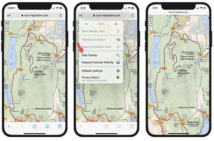
Mobile browsers show toolbars above and below the content area. On some browsers, like Safari, you can hide the toolbars to make more screen area available to the map. The screenshots below show what it looks like with the toolbars showing, how you hide them, and with the toolbars hidden. Even with the toolbars showing, mobile mode takes maximum advantage of the available screen area.
Mobile Mode Slideout
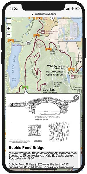
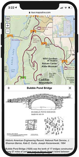
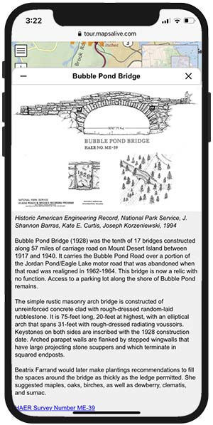
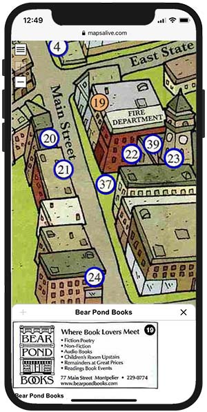
When you touch a marker in mobile mode, the marker's hotspot content appears in a slideout panel that slides out from the bottom or right edge of the map (depending on the device's orientation). If the slideout would cover the selected marker, the map pans automatically to keep the marker visible. The slideout in mobile mode is like a popup in desktop mode, but unlike a popup, you can expand and contract a slideout to show more or less content.
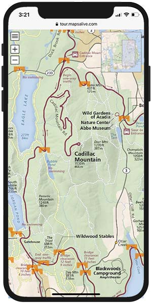
The screenshots below show a tour with no slideout (left), a short slideout (middle), and a tall slideout (right). You expand or contract the slideout by touching the +/- icons or the title bar of the slideout.
Mobile vs Desktop Mode
The table below points out the differences in how a tour behaves when running in desktop mode versus mobile mode.
| Behavior | Desktop Mode | Mobile Mode |
|---|---|---|
| Map occupies all of the available space | Yes for Flex Map tours | Yes for all tours |
| You can zoom and pan the map | Yes | Yes |
| Supports mouse-over and mouse-out events | Yes | No (supports only touch and click) |
| Map auto-pans when a marker is selected | No | Yes when necessary to keep the marker visible |
| Hotspot content appears in a slideout | No | Yes for all tours |
| Slideouts are expandable | --- | Yes, when there is a lot of content |
| Hotspot content appears in a popup | Yes for tours that use popups | No |
| Popups are expandable | No | --- |
Portrait Orientation
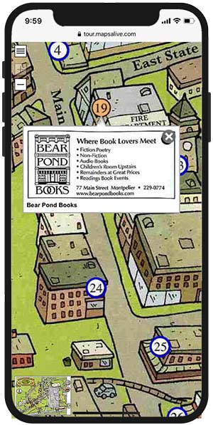
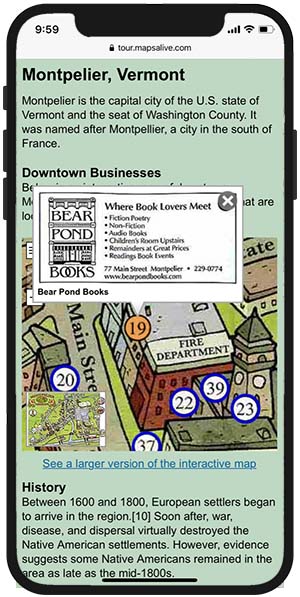
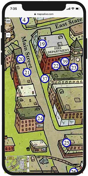
The screenshots below show a tour that is embedded in a web page and not in mobile mode (left), in mobile mode with no slideout (middle), and in mobile mode (right) with a short slideout that does not expand because the image is small and there is no additional content. The difference in appearance and usability between an embedded tour, which runs in desktop mode, and a tour running in mobile mode, is dramatic.
Landscape Orientation
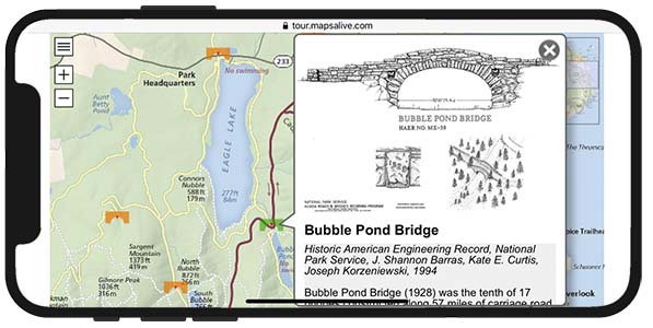
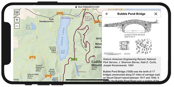
The screenshots below show a tour in mobile mode with a narrow slideout (left), and with a wide expanded slideout (right). In both the narrow and wide slideouts, the text area can be scrolled up and down.
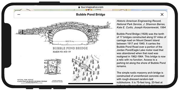
Desktop mode on a small mobile device
The screenshots below show a tour running in desktop mode on a small mobile device. In desktop mode, hotspot content is displayed in a popup instead of a slideout. Normally a tour automatically runs in mobile mode on a small mobile device, but you can use the mobile tour setting to enable desktop mode on a mobile device and vice-versa.
How to control what MapsAlive considers to be a small mobile device
Use the small-mobile tour setting.
