Layouts
This section provides information about how to work with popup and tiled page layouts. For other layout-related topics, see:
- Getting Started: Layouts
- Gallery Size and Shape
- Data Sheets
- Title Bars and Footers
- Banners
- Popup Behavior
- Responsive Tours
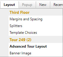
You initiate most layout-related tasks from the Tour Builder's Layout menu (click below to see the menu).
Layout menus
Tour Size
When you run a tour, its size is determined by a combination of:
- The width and height settings in the Tour Builder
- Whether the tour is a Classic tour or a Flex Map tour
- The available space in the browser or web page container
- The maximum size of the map image
Classic tour size
A Classic tour has a fixed width and height that defines the tour's size and aspect ratio. When you run a Classic tour it displays at its full size so long as there is enough space in the browser or web page container. The tour will never display larger than the tour size, but as the browser or web page container gets smaller the tour will scale-down to fit while maintaining its aspect ratio.
How to set the tour size for a Classic tour
- Choose Layout > Advanced Tour Layout from the Tour Builder menu
- On the Advanced Tour Layout screen:
- Enter the width and height for the tour when displayed in a browser
Flex Map tour size
A Flex Map tour does not have a fixed width or height. The tour's dimensions automatically adjust to use as much screen space as is available in the browser or web page element that contains it. Flex maps always display as large as possible up to the maximum dimensions of the map image.
The tour size specified on the Advanced Tour Layout screen for a Flex Map tour only control the size of the Map Editor in the Tour Builder. For more information, learn about the Map Editor.
Tour Layouts
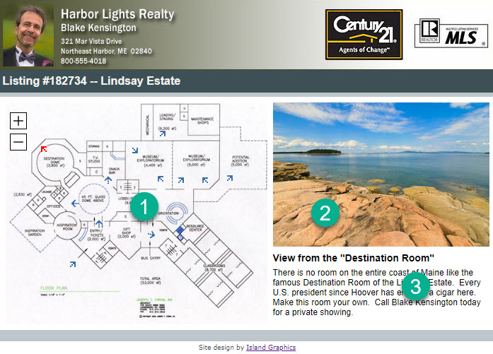
Layouts define the arrangement of your map, gallery, data sheet, media, and text within each page in your tour. You can display hotspot content in popups or display your hotspot content next to your map. If your tour has more than one page, you can choose a popup layout or a tiled layout for each page.
Popup Layouts
Hotspot content displayed in popups appears over the map or gallery when you mouse over, touch, or click markers. When there is room in the browser window, popups can appear beyond the boundaries of the tour area, taking advantage of more available space. You can change the arrangement of the media and text with Popup Templates. Both Classic tours and Flex Map tours can use popup layouts.
How to use popups for a map or gallery
To use popups for a map:
- Choose Map > Setup from the Tour Builder menu
- On the Map Setup screen:
- Click the Popup radio button
To use popups for a gallery:
- Choose Gallery > Setup from the Tour Builder menu
- On the Gallery Setup screen:
- Click the Popup radio button
Popup size and appearance
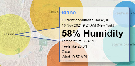
You can customize a popup's maximum and minimum size, as well as its border, colors, popup corner radius, and drop shadow. The popup below has a 2-pixel blue border, rounded-corners, a drop shadow, and a light blue title. It also has a semi-transparent background.
How to set the popup background transparency (opacity)
You can control the opacity of a popup's background with the CSS shown below:
#maPopupPanel {
   background-color: rgba(255,255,255,0.65);
}
#maPopupTitle, #maPopupText {
   background-color: rgba(255,255,255, 0.0);
}
The CSS sets the popup's background color to white with 65% opacity. It sets the background color of the title and text to white with 0% opacity. You can of course choose any color and opacity you like. You can add the CSS in your tour in the CSS field on the Custom HMTL screen.
Even though you set a maximum size for popups, MapsAlive automatically reduces the popup size based on the size of your hotspot images.
The Popup Size and Appearance screen below shows the settings that define the appearance of this popup.
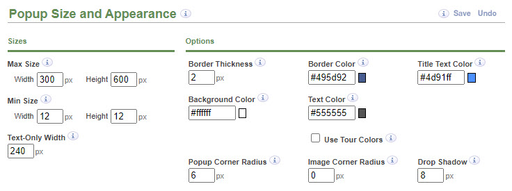
On the Popup Size and Appearance screen you can mouse over the Quick Help entries next to each field to get more information.
How to set the popup size and appearance
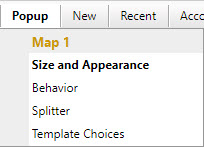
- Choose Popup > Popup Size and Appearance from the Tour Builder menu
- On the Popup Size and Appearance screen:
- Customize the size and appearance settings
Overriding the popup size
The popup size and appearance settings apply to all the popups for one map or gallery. You can also override the popup size for a specific hotspot. This is useful if you want a specific popup to be smaller or larger than the others.
How to override the size of a specific popup
- Click the hotspot name in the Tour Navigator
- Choose Hotspot > Advanced Hotspot Options from the Tour Builder menu
- On the Advanced Hotspot Options screen:
- Set the exact width and/or height for the popup
Tiled Page Layouts
Tiled page layouts display the map or gallery and hotspot content side-by-side within a rectangular area. You can choose the arrangement of the map or gallery, media, and text areas using Tiled Page Templates. Only Classic tours can use tiled page layouts.
The parts of a tiled page layout are identified in the screenshot below:
- Map Area
- Media Area
- Text Area
How to make a map or gallery use a tiled page layout
To use a tiled page layout for a map:
- Choose Map > Setup from the Tour Builder menu
- On the Map Setup screen:
- Click the Tiled radio button
Note: You cannot choose a tiled page layout for Flex maps.
To use a tiled page layout for a gallery:
- Choose Gallery > Setup from the Tour Builder menu
- On the Gallery Setup screen:
- Click the Tiled radio button
Margins and Spacing
Margin and spacing settings control the amount of space around the outside of the map, gallery or data sheet, and between the map or gallery and the media and text areas of your tour. Spacing settings control the amount of space between the media and text areas.
The Canvas Background color of the tour's Color Scheme fills the margins and spacing areas when they are greater than zero.
You cannot set the map margins for a Flex Map tour because Flex Maps always adjust to fill the containing space.
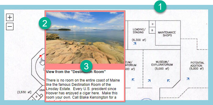
Popup margins and spacing
The popup margin and spacing areas are identified in the screenshot below:
-
The map margin is the amount of space around the outside of the map area (shown in blue).
-
The popup margin is the amount of space around the popup (4-pixel popup margin shown in pink).
-
Spacing is the space between the media area and the text area (20-pixel spacing shown in pink).
You set the map margins on the Map Margins screen and the popup margin and spacing on the Popup Size and Appearance screen.
How to set map margins for popup layouts
- Choose Layout > Map Margins from the Tour Builder menu
- On the Map Margins screen:
- Type margin values in pixels in the Margins fields
How to set popup margins and spacing
- Choose Popup > Popup Size and Appearance from the Tour Builder menu
- On the Popup Size and Appearance screen:
- Type margin values in pixels in the Margins fields
- Type a spacing value in pixels in the Spacing field
Tiled page layout margins and spacing
The tiled page layout margin and spacing areas are identified in the screenshot below:
- The map margin is the amount of space around the outside of the tiled layout area (map or gallery and media and text areas.
- Spacing is the amount of space between the media area and the text area, and between the map or gallery area and the media and text areas.
You set both the map or gallery margins and the spacing on the Margins and Spacing screen.
How to set tiled page layout margins and spacing
- Choose Layout > Margins and Spacing from the Tour Builder menu
- On the Margins and Spacing screen:
- Type margin values in pixels in the Margins fields
- Type spacing values in pixels in the Spacing fields
Templates
Templates define the arrangement of the map or gallery area, media area, and text area for each page in your tour. Each page in a tour can use a different template.
Popup templates
For popup layouts, you can only choose the arrangement of the media area and text area within the popup because the map or gallery area displays separately from the hotspot content. You can also choose a template that only displays the text area or only displays the media area.
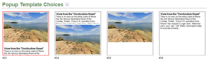
How to choose a popup template
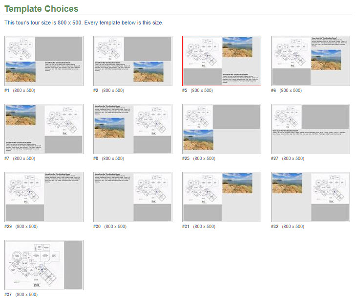
- Choose Popup > Template Choices from the Tour Builder menu
- On the Popup Template Choices screen:
- Click a template thumbnail
Tiled page layout templates
For tiled page layouts, you can choose the arrangement of the map or gallery area, media area, and text area. You can also choose a template that displays the map or gallery and the media area, a template that displays the map or gallery and the text area, or a template that only displays the map.
How to choose a tiled page template
- Choose Layout > Template Choices from the Tour Builder menu
- On the Template Choices screen:
- Click a template thumbnail
Splitters
You can control how much of the layout is used by the map or gallery, the media area, and the text area on the splitters screens. You can drag the horizontal or vertical sliders (see red arrows in the screenshots that follow) to adjust the percentage of space used by each area.
When you first create a new tour, you may find that its initial splitter settings may not make the best use of the space based on the size and shape of your map and images. It may take a little bit of trial and error to adjust the splitters to get the best layout for your tour. You may also find you'll need to adjust the tour size. Experiment with the settings and use Tour Preview to see the results.
Popup splitters
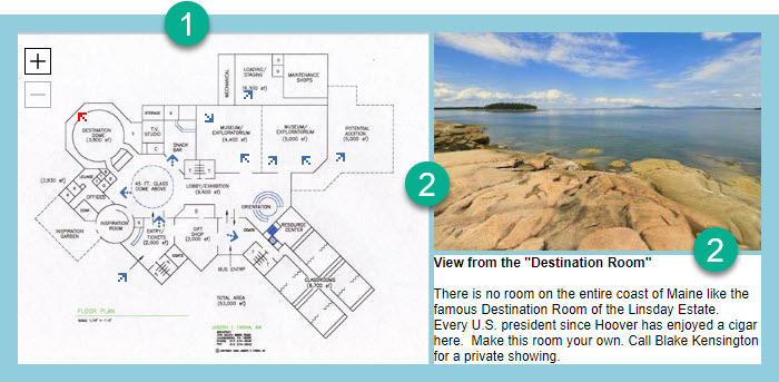
The Popup Splitter screen lets you set the size of the media and text areas within the popup. Depending on the layout template chosen, you can drag either the horizontal or vertical slider to adjust the sizes of the media and text areas.
The slider lets you set the maximum height or width of the media area, but when the tour is run, each popup is automatically adjusted to best fit its content. For example, if your hotspots display images of different sizes, the media area will adjust based on the image size but will not exceed the maximum you set.
In the popup layout below, the media area will use up to 65% of the popup height and the text area will use the rest.
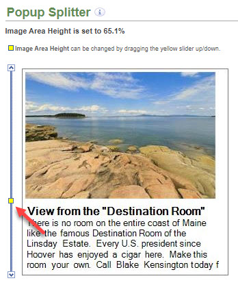
How to adjust the popup splitters
- Choose Popup Splitter from the Tour Builder menu
- On the Popup Splitter screen:
- Drag the horizontal or vertical slider
Tiled page layout splitters
The Splitters screen lets you drag the horizontal and vertical splitters to set the size of areas with the tiled page layout.
In the layout below, the map area width will use 65% of the tour width and the media area will use up to 40% of the tour height.
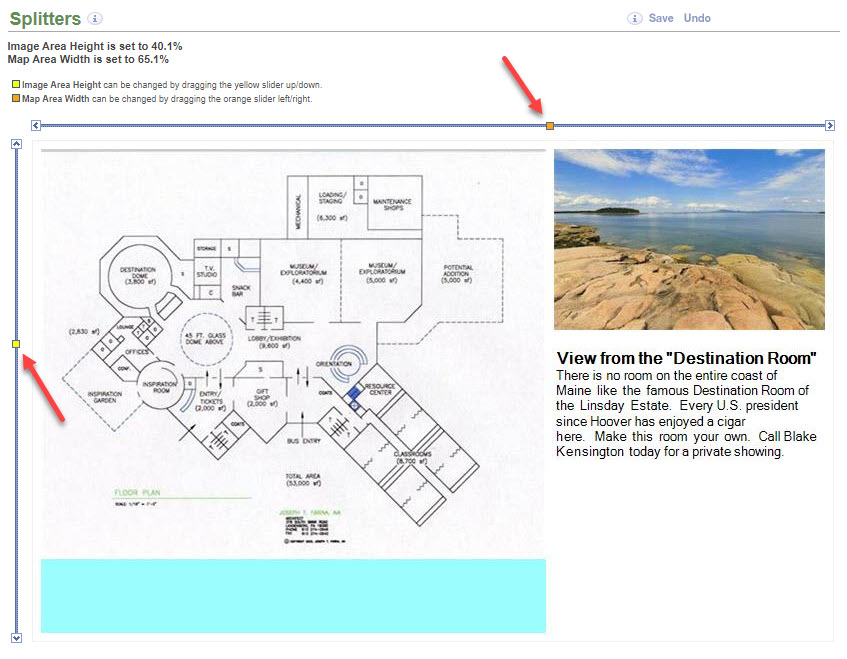
The cyan area below the map in the screen shot above is used to show that the map area extends to the bottom of the layout. The Splitters page always shows the map image zoomed all the way out so it does not fill the map area in the preview, but when you run the tour the map will fill the entire map area as it zooms in.
Changing the tour width and height may affect the splitter settings
How to adjust the tiled page layout splitters
- Choose Layout > Splitters from the Tour Builder menu
- On the Splitters screen:
- Drag the horizontal and vertical sliders
Data Sheet Layouts
A data sheet has no map or hotspots, but you can still choose a layout, set margins and spacing, and adjust the splitters the same way you do for tiled page layouts that use maps and galleries.
How to set data sheet margins and spacing
- Choose Layout > Margins and Spacing from the Tour Builder menu
- On the Margins and Spacing screen:
- Type margin values in pixels in the Margins fields
- Type spacing values in pixels in the Spacing fields
How to choose a data sheet template
- Choose Layout > Template Choices from the Tour Builder menu
- On the Template Choices screen:
- Click a template thumbnail
How to adjust data sheet splitters
- Choose Layout > Splitters from the Tour Builder menu
- On the Splitters screen:
- Drag the horizontal and vertical sliders